

One of the first things that stood out to me when we first saw our home was how dark it was, especially the kitchen. The mahogany-colored cabinetry, slate-look vinyl flooring, black laminate countertops, and limited natural light from the kitchen’s only window made the space feel dark and confined.
But I wanted our kitchen to feel different.
I wanted it to feel light and airy, open and inviting, with plenty of room to cook and create. I also wanted it to feel timeless and classic, with a bit of personality and flair sprinkled in—a space that could evolve along with us and inspire delicious meals around the table for years to come.
So even before we figured out what the full scope of our renovations would be, I knew our kitchen cabinets needed to be white.
And that single decision became the foundation for all the other paint colors in our home.
The Foundation: Chantilly Lace
Now, if you’ve ever tried to pick out white paint, you know that it is not as simple as it sounds. There are 5,486 different shades of white to choose from and all of them serve different purposes. So the first step was to figure out the right white to use for our particular space.
If you’re currently trying to choose the right white for your own home, check out The Right White: How to Choose a White Paint Color You’ll Love.
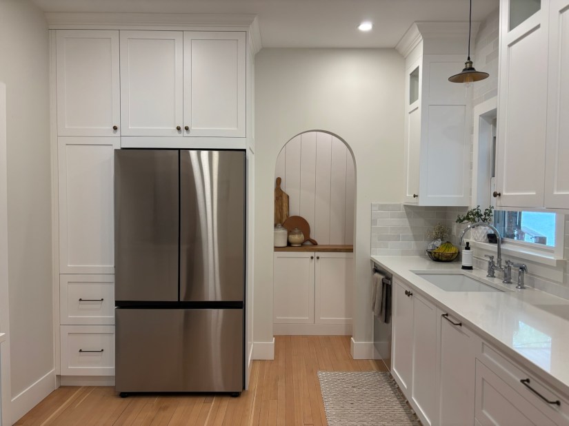
Because our kitchen does not have much natural light, I did not want to use an off-white or a creamy white for the cabinetry, as I thought these may make them feel a bit dull even with the lights on. But with the traditional feel of our home, I also didn’t want to use a white with cooler undertones, as it could make the space feel cold and sterile. So, I needed to find a white somewhere in-between, with a nice balance between warm and cool undertones.
A tried and true option that seemed to check all the boxes was Benjamin Moore’s OC-65 Chantilly Lace. Chantilly Lace is a classic neutral white with minimal undertones, making it a very versatile foundation for our home.
Because of its versatility, it was also a perfect color option to use for all of the doors, trim, and painted ceilings throughout our home. We used a pearl finish for the trim, doors, and cabinetry and a flat finish for the ceilings. Matching the trim, doors, and painted ceilings to the color of our cabinets also helped to make our cabinets feel cohesive with the rest of the home, like they’ve always been there.We also knew that using a versatile white like Chantilly Lace for the cabinets, trim, doors, and painted ceilings would give us some flexibility with the wall paint color, which we hadn’t yet narrowed down.
Overall, it was the perfect choice for our home. Our kitchen feels bright and spacious, even with the lights off and this white truly became the foundation for all the other paint selections throughout our home.
The Support: Cloud Cover
Once we decided to use Chantilly Lace for the cabinetry, doors, trim and painted ceilings, we then moved on to picking out a paint color for our walls. And this was a much more difficult decision.
We wanted our home as a whole to feel warm and welcoming, but still neutral and classic. We wanted the walls to be white, but not too white, able to provide some warmth and contrast from our trim color without the walls themselves becoming a focal point especially with some of the more ornate architectural details of our home. We also wanted it to work well with the mix of greys and beiges and wood tones throughout our furniture and finishes.
So we searched for the right white, debating between different paint chips with a variety of undertones, testing and retesting samples. It took a while, but we eventually narrowed it down to an option we felt could work for our space: Benjamin Moore’s OC-25 Cloud Cover in an eggshell finish.
Cloud Cover is another classic white with subtle hints of gray, which pairs perfectly with the brighter, crisper look of Chantilly Lace. Aside from our kitchen, the majority of our home receives an incredible amount of natural light throughout the day. With that, the very slight blue undertones of Cloud Cover help to balance the otherwise warm undertones of fixed finishes like our Douglas fir hardwood, which are even further enhanced by all the natural light.
And I must say. I am so happy with this color selection. Cloud Cover has provided the support from which we could build off of for all the other fixtures, furniture and finishes throughout our home. Instead of picking out a dozen different wall colors, hoping that they all somehow work together without feeling too overwhelming or busy, this neutral palette has given us the opportunity to incorporate other colors and features throughout our home, while maintaining a cohesion throughout. And it has helped to enhance the original architectural features of our 1938 home, rather than competing with them.
Cloud Cover was just the neutral, classic, and timeless support our walls needed and I’m very pleased with how it turned out.

The Personality: Boothbay Gray & Kendall Charcoal
Now just a few years ago, I would have left it at that. Pair Chantilly Lace with Cloud Cover and call it good.
It is neutral. It is flexible. It is safe.
But as we navigated through the renovations for our home, I realized I didn’t just want our home to feel safe. I wanted it to feel intentional and personal. I wanted it to feel true to the era of the home, but also unique to us and maybe even slightly whimsical. And that’s where our other paint color selections came in.
Throughout most of our home we opted to keep the color palette clean and neutral, as we wanted to give our furniture, artwork and seasonal decor room to change along with us. Chantilly Lace and Cloud Cover helped to lay the foundation and support system for these spaces that would allow us to keep creating and expressing our personal style through a variety of other means such as textiles, wallpapers and decor.
But when we renovated our laundry room, I knew I wanted it to feel a bit more fun and unexpected. I found inspiration from a few laundry rooms and mudrooms on Pinterest with beautiful blue-gray cabinetry and instantly fell in love. The color was Benjamin Moore’s HC-165 Boothbay Gray in a pearl finish and I knew we needed to try it. After testing it and seeing how effortlessly it paired with Chantilly Lace and Cloud Cover, we decided to use it for our laundry room cabinets and I absolutely love how it turned out.
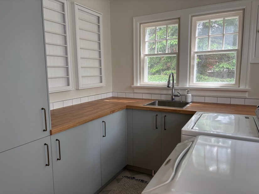
Boothbay Gray has also become a “red thread” throughout our home, popping up in other places such as the doors throughout the rear addition to our home, the board and batten feature wall in our basement, even the desks in our office – places where some color could add interest without overwhelming the space. Using this color selectively throughout our home has helped to sprinkle a little personality to otherwise neutral spaces, while the subtle repetition of the color has helped to create cohesion between them.

Another accent color we opted to use throughout our home is Kendall Charcoal in a pearl finish. When we renovated the addition to our home, I wanted to paint our stair railing, but I was not sure which color to use. I had painted the doors throughout Boothbay Gray, but didn’t feel that that was the right color to also use for the railing. So I began looking into some other options in the same color family. That’s when I saw Benjamin Moore’s HC-166 Kendall Charcoal, a rich dark charcoal gray color. Its slightly warm undertones make it feel cozy and grounded, which was exactly what our hallway needed. We once again, subtly repeated this color for the inside of our coat closet as well as our dining chairs to create cohesion between the various parts of our home.

Overall, I don’t really have a formula for deciding where to add these pops of color. After years working with a custom home builder, I’ve developed a bit of an instinct for noticing when a space is calling for something extra. But one thing I’ve noticed is that I’m often more willing to experiment with color in spaces where we don’t spend as much of our time. Laundry rooms, hallways, powder rooms, and family rooms can all be great places to take a little more of a risk. These spaces don’t necessarily need to be as flexible as the rooms we live in every day, and a bit of color can help add a pop of personality and make them feel surprisingly special.
Our paint colors don’t tell the whole story of our home, nor do I think they need to. They simply provide a foundation for us to continue to create and curate the things that make our house our home: artwork, furniture, textiles, seasonal decor and occasional pops of color.
What started as simple desire to make a dark kitchen feel light and inviting ultimately became a simple approach to the rest of our home: create a foundation we love, add personality where it feels right and leave plenty of room for our home to change along with us.
For a peek into more of our journey through renovations and the story of how this house slowly became home, be sure to read Finding Joy in the Journey: How This House Became Home.

You Might Also Enjoy
- The Right White: How to Choose a White Paint Color You’ll Love
- Finding Joy in the Journey: How This House Became Home
- A Glimmer of Possibility: The Story Behind Our Home
- The Gift of Home: A Kingdom Perspective on Creating Spaces
- Crafting a Home: Our Journey Through DIY Hallway Updates
Join The Journey
Subscribe to receive new posts and occasional notes from This Darling Adventure, with stories, ideas, and encouragement for cultivating a beautiful life, one small, intentional step at a time.
 This Darling Adventure